Krostu is a financial management platform designed to help users effectively track and manage their income and expenses, ensuring better control over their finances.


Task
The design should convey professionalism, reliability, and financial expertise while maintaining a modern and approachable feel. Incorporate elements that symbolize financial management, such as growth, balance, or structure, while ensuring the logo remains simple and versatile for use across digital and print platforms. Avoid overly complex details, focusing instead on clarity and recognizability.
Solution
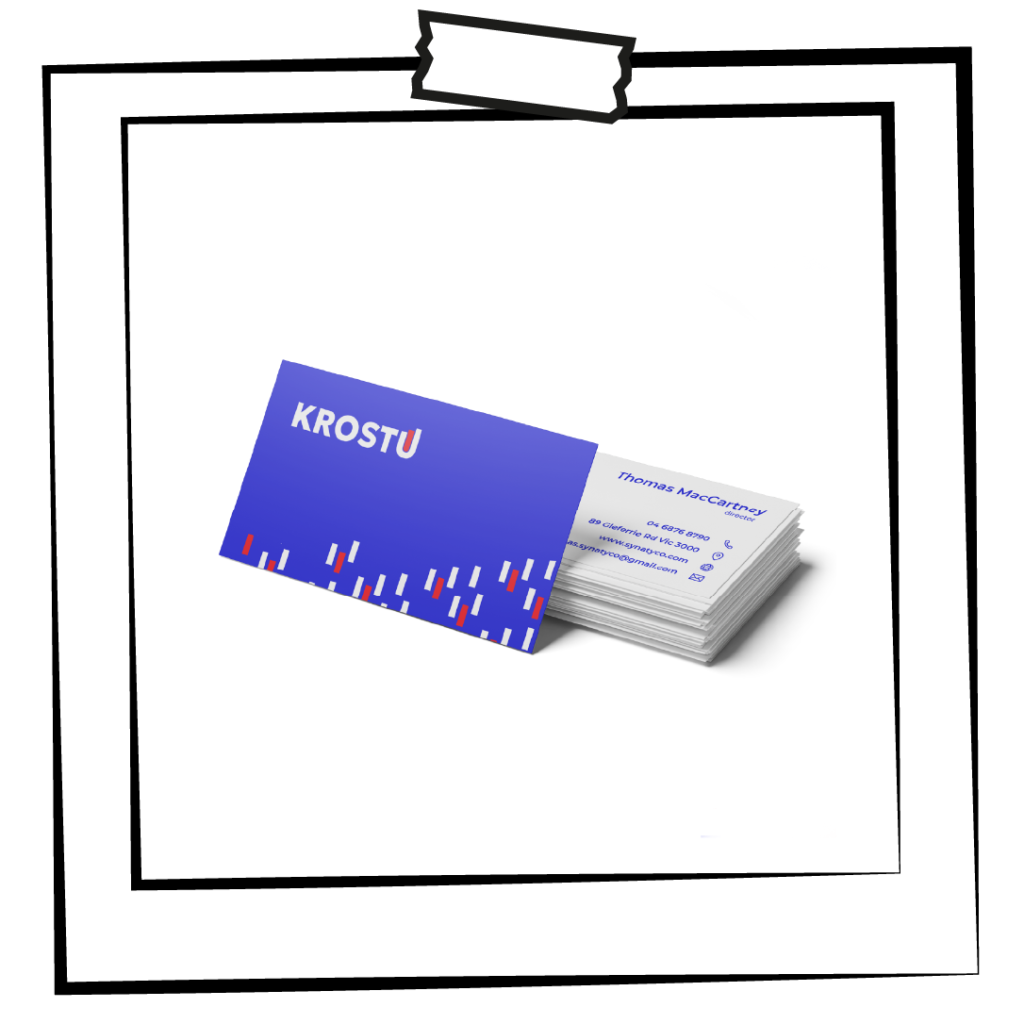
I designed a text-based logo that embodies professionalism and clarity, essential for a company in the financial sector. The font is calm and restrained, aligning with the trustworthy image of a financial management platform. A subtle graphic element of a rising chart is seamlessly integrated into the design, serving as a dual symbol: it reflects the company's focus on finance and statistics while also representing growth, tying directly to the meaning of the name "Krostu. (eng: to growth)" This minimalist approach ensures the logo is both modern and versatile, suitable for various branding needs.

Logo idea

Logo
Icon

Font & color

Visualization
