


2Atm offers professional tire services, including installation, repair, and maintenance, to ensure your vehicle's optimal performance and safety. Utilizing advanced equipment and skilled technicians, 2Atm delivers fast and reliable service. Committed to excellence, 2Atm provides comprehensive tire solutions tailored to meet the specific needs of each customer.


Task
Redesign a logo for 2Atm's network of workshops that maintains brand recognition by incorporating the existing corporate colors and design elements from the past logo. The new logo should modernize the previous design while ensuring it remains familiar and easily recognizable to customers. Ensure the logo is versatile for various applications, including signage, digital platforms, and marketing materials, to maintain a consistent brand identity across all mediums.
Solution
I retained the core concept of the previous logo by incorporating the pressure gauge arrow within the letter "A" to maintain brand recognition. I eliminated all the small details to create a cleaner and more streamlined design. A modern font was used to give the logo a contemporary and professional look. The existing corporate colors were preserved to ensure continuity and familiarity. This updated logo effectively bridges the past and present, making it versatile for various applications, from workshop signage to digital platforms. The result is a recognizable, modern logo that reflects 2Atm's commitment to quality and reliability.

Was

Became
Logo idea

Logo
Icon
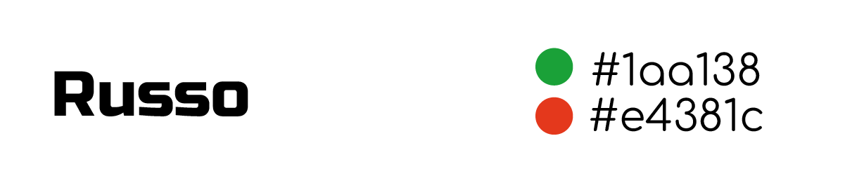
Font & color
Visualization


